 Make It Responsive
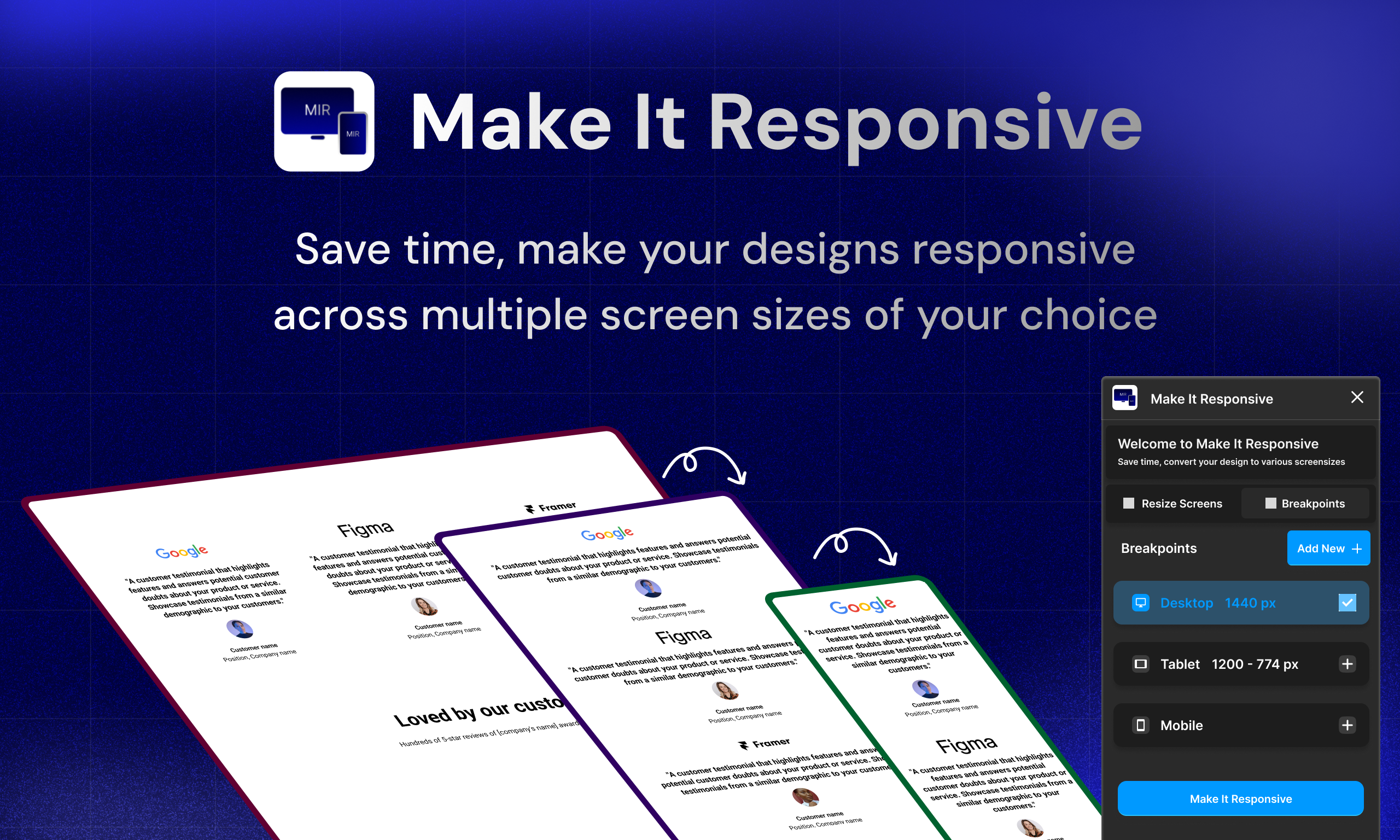
Make Your Designs Responsive in One Click
Quickly test and convert your designs across multiple device sizes whether it's Android, iPhone, Tablet, Desktop in one click!
How It Works
Transform your designs for any screen size in seconds with just a few clicks
Select Your Frame
Select any frame or group you want to modify in your Figma design
Open the Plugin
Go to Plugins > Make it Responsive in the Figma menu
Select Device Sizes
Choose which device sizes you want to test and click "Make It Responsive"
Key Features
Supercharge your Figma workflow with these powerful features
Responsive Magic
Whip up polished desktop, tablet and mobile versions of your designs in seconds.
Work Smarter
Skip the repetitive work and focus on what you love: creating amazing designs!
Save Time
Get 80% of your responsive designs ready in record time —so you can save time for the fun stuff!
Simple Pricing
Choose the plan that works best for you and your team
Free
Perfect for trying out the plugin
- Basic responsive testing
- 3 device presets
- Community support
Pro
For professional designers
- Advanced responsive testing
- Unlimited device presets
- Custom breakpoints
- Priority support
Team
For design teams
- Everything in Pro
- Team collaboration
- Team libraries
- Dedicated support
Ready to Make Your Designs Responsive?
Join thousands of designers who are saving time and creating better experiences with Make It Responsive.